


Good user interface design improves user experience as a whole. It makes it simple, intuitive, efficient, and fluid for the user to interact with the app or site. Thereby, when it works well, the user might not even notice it’s there.
A lot of the users appreciate the seemingly effortless simplicity of UI and UX of many companies such as Trello, Netflix, Instagram, and much more. They attest to the easy digestibility of a huge amount of information, the sleek lines, and color palettes that make it an easy design for any size handheld device.
So, here is the list of 10 painful UI/UX that you should avoid when designing your website or mobile application.
1. Unnecessary Information
It is important to stop providing unnecessary information to the user which they do not want to see. You know the outgrown fame of WhatsApp with its great UX and a clean interface to make it the best messaging application that is used by many users. The painful UI fail is its feature that shows if you delete a message before the receiver views it. Actually, the feature shows a text message “you deleted this message” to tell the receiver that the sender deleted the message.
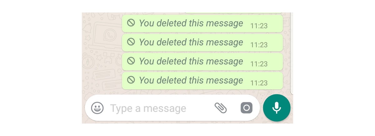
This feature somehow breaks the purpose of deleting the message in the first place.
2. Auto-play
After mentioning the unparalleled user experience of Netflix, it is crucial not to follow the autoplay feature that has been perturbing viewers since 2015. Even a split-second hovering over a TV show or movie thumbnail activates the autoplay of a looped trailer or mount. This means that whether users wish to see the details or specifics of the show they clicked on or hovered over, they would not be able to do so without a loud teaser playing. Not just auto-playing, auto-anything is against the user’s desire. Make sure that your designers know it well.

3. Lack of User Options
Let’s consider that the user wants to capture a priceless and time-sensitive moment with their mobile camera. And the phone shows like in the below image. Note carefully that the notification does not provide the user with an option that lets them clear space in their phone memory. Instead, it shows done and settings options. These are not the options that the users required right now. You should provide the users with options to delete pictures by showing the image size and the number of images they need to delete to take pictures. These are the epic UI/UX fails that you should avoid.

4. Long DropDowns
At some point, we all had to choose our nationality from an almost limitless dropdown with no search bar in sight. There’s an extra element of inconvenience if you’re from something like the United Kingdom with numerous titles (United Kingdom/Britain/Great Britain) and you find yourself browsing through an infinite sea of countries only to find yours. Long drop-downs without subheadings or filtering are incredibly time-consuming for users, particularly those unaware of what they are searching for.

5. The Password Struggle
As if we don’t have a million passwords to recall, there’s nothing more annoying than needlessly confusing login password specifications like those below. Complex passwords are more difficult to recall, which means that you are more likely to spend time continually generating new passwords to replace existing ones. A lengthy list of password specifications is time-consuming and wasteful. Since a new, million-letter-long password is unlikely to be remembered by the user.

6. Explicit Rating Display
Rather than showing the number of stars in an explicit way, if you opt for a 1-star 5-star rating against conventional UX criteria, it makes it uncomfortable for users. This is more resource expensive than the choice of several different star icons representing the ranking. At a glance, consumers who are used to approximate the explicit number of stars reflecting the ranking could conclude that the product in question only received a 1-star rating. Placing a star next to a number is anti-intuitive to users and thus does not even count as a rating at all.

7. Lacking contrast
When you visit the website, you would like to see it with a simple and new comparison. This will help us learn and interpret the details there because we know how to do the process. If no contrast is used, both the color mix and the general view of the website would overwhelm us. It’s pretty hard to read the content on the website.
8. Not-responsive Design
It’s pretty common to use responsive design because you don’t see a justification to create a website that can’t fit the resolution and scale of the device. It’s a must particularly for shopping cart websites/apps whose target audiences come from mobile devices.
9. Inconsistent Style
It doesn’t mean that the mashup style isn’t fine, but if the overall interface has a massive and hideous graphic clash, it’s best to overhaul it. An excellent UI interface should be compatible with the theme to understand and react to the content easily. It would also do well to increase job quality.
10. Bad Information Architect
Everyone needs to stand out from the crowd, and his design work will appeal to others’ attention. But often, it only goes to the other side if we overemphasize the imagination of the concept. Holding a good balance in the visual hierarchy will leave a good impression on users and give them more detail. The one below will give us more or less a sense of chaos and uncertainty.
So there are 10 cases of poor UX architecture, from games to booking sites and dysfunctional juicers. As we have seen, it is always very enticing to go for aesthetically appealing templates or smart, funny messaging over simple, straightforward functionality. But emphasizing user research would ensure that you’re sure to build something that works for the user, and that’s what really matters.
Create an engaging and appealing interface by combining the above UI/UX design trends. If you need help in implementing these UI/UX design, get in touch with our industry experts to get a free quote. They will be happy to help you with the same by turning your idea into reality.